The Art of Harmonizing Floor and Wall Paint Colors

Elevating Your Space with Perfect Pairings

When it comes to interior design, one of the most crucial decisions homeowners face is choosing the right color scheme for their floor and wall paint. The colors you select play a pivotal role in setting the tone, ambiance, and overall aesthetic of your living space. This article explores the intricacies of color coordination between floors and walls, delving into the significance of this match, the diverse types of floor and wall decorations available, and providing detailed insights into selecting colors for wood and ceramic floors. Additionally, we'll unveil expert-recommended color matching schemes based on the Pantone color card, helping you transform your home into a masterpiece of harmonious hues.

The Importance of Matching Floor and Wall Paint Colors
Bedroom furniture lohabour

The harmony between floor and wall colors is akin to the symphony of an orchestra. When perfectly orchestrated, it creates a visual masterpiece. Mismatched colors can make a room appear chaotic and unsettling. Matching these colors thoughtfully, on the other hand, creates a seamless flow, making the space appear larger, cohesive, and inviting.

Types of Floor and Wall Decorations

Flooring and wall coverings come in various forms, from traditional hardwood and luxurious marble to versatile ceramics and contemporary laminates. Each material offers distinct textures and aesthetics, catering to diverse preferences and interior styles.

Selection of Wood Floor Color
Modern living room furniture lohabour

Choosing the right wood floor color is a significant decision, as it not only impacts the aesthetics of your space but also influences the room's ambiance and perceived size. To make an informed choice, consider the following factors:

1. Natural Light and Room Size:

Natural light can dramatically affect how wood floor colors are perceived. In rooms blessed with abundant sunlight, lighter wood colors like oak, maple, or hickory can amplify the sense of spaciousness and bring an airy, open feel to the area. Conversely, in rooms with limited natural light, darker wood tones such as walnut, mahogany, or cherry can add warmth and create a cozy atmosphere. Darker woods absorb light, minimizing the starkness of the shadows and making the room feel more inviting.

2. Existing Color Palette:

Consider the existing color palette of your furniture, walls, and decorative elements. For a cohesive look, choose a wood floor color that complements or contrasts harmoniously with the existing tones. If your walls are neutral, you have the flexibility to experiment with a broader spectrum of wood shades.

3. Style and Atmosphere:

Different wood colors evoke distinct moods. Lighter woods, like pine and ash, exude a casual, contemporary vibe, making them ideal for modern or minimalist interiors. Mid-toned woods, such as oak and hickory, offer a balance between warmth and sophistication, making them suitable for various styles, including traditional and transitional. Darker woods like walnut and mahogany emanate luxury and elegance, enhancing the ambiance of formal spaces like dining rooms or home offices.

4. Maintenance Considerations:

Lighter wood floors tend to show less wear and tear, scratches, and dust, making them an excellent choice for high-traffic areas and homes with pets and children. Darker wood floors, while incredibly elegant, may require more frequent cleaning to maintain their polished appearance. Consider your lifestyle and the level of maintenance you are willing to invest in when choosing the wood floor color.

5. Experimentation with Samples:

It's essential to view wood samples in different lighting conditions within your own home. Natural and artificial lighting can significantly alter the perceived color of wood. Take home samples of your preferred wood options and observe how they look during different times of the day. This hands-on approach provides a more accurate understanding of how the wood floor color will interact with your space.

6. Maintenance Considerations:

Apart from the color, consider the finish of the wood. Matte finishes offer a more natural, rustic look and are excellent at hiding minor scratches and imperfections. Semi-gloss and high-gloss finishes, while adding a contemporary sheen, can be more susceptible to showing scratches but are easier to clean.

7. Sustainable Choices:

For environmentally conscious homeowners, it's worth exploring eco-friendly wood options. Reclaimed wood, bamboo, and engineered wood products made from sustainable sources offer beautiful alternatives while promoting responsible forestry practices.

In summary, the selection of wood floor color involves a delicate balance between personal preference, practicality, and the room's overall design. By taking into account natural light, existing decor, desired atmosphere, maintenance needs, and sustainable options, you can make an informed decision that not only enhances the aesthetics of your home but also reflects your unique style and taste. So, take your time, explore different options, and let the timeless elegance of wood flooring transform your space into a sanctuary of beauty and sophistication.

Selection of Ceramic Floor Color
Kitchen cabinet grey lohabour

Choosing the perfect ceramic floor color is a pivotal decision in interior design, especially considering the material's durability and adaptability. Ceramic tiles are available in a vast array of colors, patterns, and finishes, making them a versatile choice for various rooms in your home. To ensure you make an informed decision, consider the following factors:

1. Room Functionality and Traffic:

Different rooms have different requirements. High-traffic areas like kitchens and hallways benefit from darker-colored tiles as they tend to hide dirt and stains better, providing a practical solution for busy spaces. Lighter ceramic tiles work well in areas like bathrooms and bedrooms, creating a clean and airy atmosphere.

2. Size of the Room:

Tile size can significantly impact how spacious a room feels. Large tiles, especially in lighter shades, can visually expand smaller spaces, making them appear more open. In contrast, smaller tiles can create intricate patterns and are ideal for adding character to larger rooms.

3. Desired Mood and Atmosphere:

Color psychology plays a crucial role in setting the mood of a room. Cool colors like blues and greens create a calming ambiance, making them suitable for bathrooms or bedrooms. Warm colors such as reds and oranges inject energy and are perfect for kitchens or dining areas. Neutral tones like beige and gray provide a versatile backdrop, allowing you to experiment with bolder accents in furnishings and decor.

4. Coordination with Wall Colors:

Consider the color scheme of your walls when choosing ceramic floor tiles. If your walls are neutral, you have the flexibility to introduce more vibrant or patterned tiles. However, if your walls feature bold colors or intricate patterns, opting for simpler, complementary floor tiles ensures a harmonious balance within the room.

5. Style and Design Preferences:

Ceramic tiles come in a variety of finishes, from glossy to matte, and can mimic the appearance of natural materials like stone or wood. High-gloss tiles add a luxurious touch and reflect light, making smaller spaces appear more significant. Matte finishes, on the other hand, offer a subtler, earthy aesthetic. Consider your design preferences and the overall theme of the room when selecting the finish.

6. Maintenance and Durability:

Ceramic tiles are renowned for their durability and low maintenance. Glazed ceramic tiles are resistant to stains, water, and wear, making them ideal for areas prone to spills, such as kitchens and bathrooms. Matte tiles, while elegant, may require more frequent cleaning to maintain their appearance. Assess your willingness to invest time in cleaning and choose accordingly.

7. Experimenting with Patterns:

Ceramic tiles allow for diverse pattern choices, from classic subway layouts to intricate mosaics. Experiment with patterns to create focal points within the room. Bold geometric designs or herringbone patterns can add visual interest, transforming your floor into a work of art.

8. Environmental Considerations:

For environmentally conscious homeowners, consider eco-friendly ceramic options made from recycled materials or those produced using sustainable practices. These choices not only reduce your carbon footprint but also contribute to a healthier planet.

The selection of ceramic floor color involves a careful balance between functionality, style, and personal preference. By considering the room's purpose, size, desired atmosphere, coordination with other elements, preferred style, maintenance needs, and environmental impact, you can choose ceramic tiles that not only enhance the aesthetic appeal of your space but also provide practical and sustainable solutions. Let the versatility and beauty of ceramic floor tiles transform your home into a haven of elegance and functionality, tailored to your unique lifestyle and tastes.

Wood Floor Color and Wall Paint Color Matching Scheme
Modern fabric sofas and coffee tables lohabour

Creating a perfect harmony between wood floor color and wall paint color is akin to composing a masterpiece. When executed thoughtfully, this pairing can elevate the ambiance of your space, creating a seamless and visually pleasing environment. Here's a detailed guide on how to achieve this harmony using the Pantone color card as an example:

1. Understanding Pantone Color Card:

Pantone, a globally recognized color authority, provides a standardized color matching system. By selecting colors from the Pantone color card, you ensure consistency and accuracy in your design choices.

2. Matching Light Wood Floors:

Living room furniture armchair lohabour

For light wood floors like oak or maple, aim for wall paint colors that enhance the sense of spaciousness. Consider Pantone Serenity (a soft, tranquil blue) or Pantone Rose Quartz (a delicate, warm pink). These gentle hues create a serene backdrop, allowing the light wood to stand out while infusing the room with a calming ambiance.

3. Matching Mid-Toned Wood Floors:

White modern couch lohabour

Mid-toned woods, such as hickory or cherry, offer versatility. Pair them with Pantone Tawny Birch (a muted, earthy tone) or Pantone Grapeade (a deep, rich purple). These colors add depth to the room, complementing the warmth of the wood and creating a cozy, inviting atmosphere.

4. Matching Dark Wood Floors:

Dining room furniture design lohabour

Dark wood floors exude sophistication. To balance their intensity, opt for lighter wall paint colors. Consider Pantone Oyster Mushroom (a soft, warm gray) or Pantone Hazelnut (a light, creamy beige). These neutral tones create contrast, preventing the space from feeling too closed in while accentuating the elegance of dark wood.

5. Creating Contrast with Bold Colors:

For a contemporary touch, you can introduce bold, contrasting colors. Pair light wood floors with Pantone Fiesta (a vibrant, warm red-orange) or Pantone Lapis Blue (a deep, intense blue). Similarly, dark wood floors can be complemented with Pantone Buttercup (a lively yellow) or Pantone Green Flash (an energetic green). These combinations add flair and excitement to your space, injecting personality into the room.

6. Using Accent Walls:

If you prefer a subtle approach, consider an accent wall. Choose a wall, preferably one with architectural interest like a fireplace or a niche, and paint it a bold color from the Pantone card, contrasting or complementing your wood floor. This method allows you to experiment with vibrant hues without overwhelming the entire space.

7. Considering Natural Light:

Always assess how natural light interacts with your chosen colors. Colors can appear differently under various lighting conditions. Test your selected Pantone shades in different parts of the room and observe them at different times of the day to ensure they achieve the desired effect under various lighting scenarios.

8. Seeking Professional Advice:

If you find it challenging to decide on the perfect combination, consult with a professional interior designer. Their expertise can provide invaluable insights, ensuring your color choices align with your vision and the room's functionality.

In essence, the Pantone color card offers a diverse palette to experiment with, allowing you to create a cohesive and aesthetically pleasing relationship between your wood floor and wall paint colors. By understanding the tones and moods associated with different Pantone hues, you can transform your space into a harmonious sanctuary, where the elegance of wood and the allure of paint merge seamlessly, creating a timeless and visually stunning atmosphere.

Ceramic Floor and Wall Paint Color Matching Scheme

For light-colored ceramic floors, opt for shades that enhance the brightness, such as Pantone Chiffon Yellow or Pantone Ice Flow. Alternatively, if your ceramic tiles are darker, earthy tones like Pantone Hazel or Pantone Bison can add depth while maintaining a balanced contrast.

In essence, the process of choosing floor and wall paint colors involves careful consideration of 
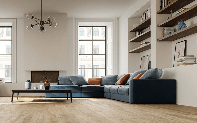
room size, lighting, and personal preference. Wood floors exude timeless elegance, and their colors can be enhanced by complementary wall shades, creating a harmonious balance. Ceramic tiles, with their durability and versatility, offer a canvas for creativity, allowing homeowners to experiment with various color combinations.

Remember, the key lies not just in individual color choices but in the seamless integration of these colors throughout your space. By following the Pantone color card examples provided, you can embark on a transformative journey, turning your home into a haven of aesthetic cohesion and visual delight. So, pick up your paintbrush and flooring samples, and let the artistry of color transform your living space into a masterpiece of design and elegance.

Minimalist modern white corner sofa lohabour

Remember, the key lies not just in individual color choices but in the seamless integration of these colors throughout your space. By following the Pantone color card examples provided, you can embark on a transformative journey, turning your home into a haven of aesthetic cohesion and visual delight. So, pick up your paintbrush and flooring samples, and let the artistry of color transform your living space into a masterpiece of design and elegance.

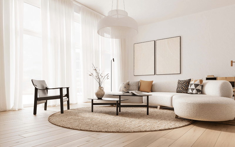
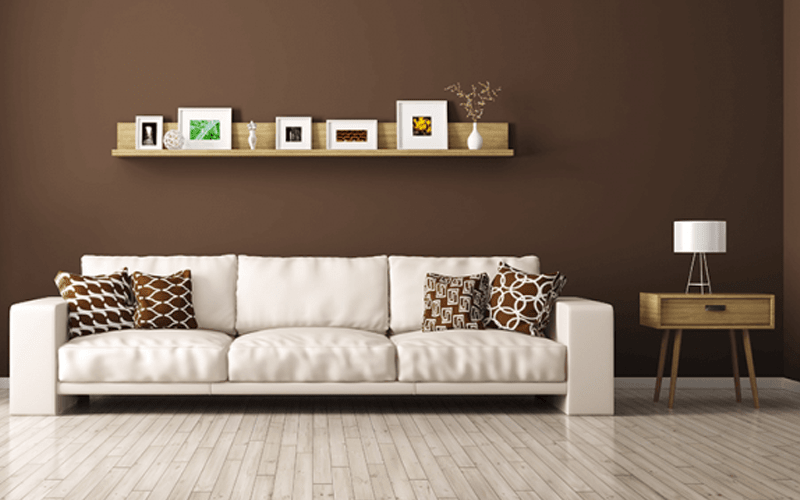
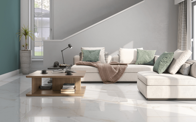
1. Matching Light-colored Ceramic Floors:

Contemporary living room furniture design lohabour

Light-colored ceramic floors, such as soft whites or pale grays, offer a clean and airy backdrop. Complement these with wall paint colors like Pantone Chiffon Yellow (a delicate, muted yellow) or Pantone Ice Flow (a crisp, icy blue). These soft tones maintain the room's brightness while adding subtle warmth or coolness, depending on the chosen hue.

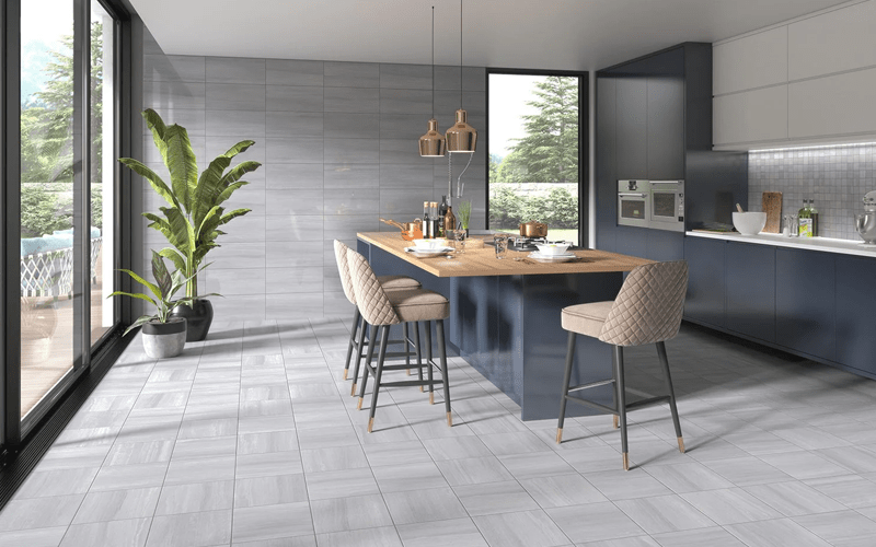
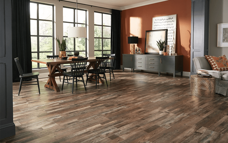
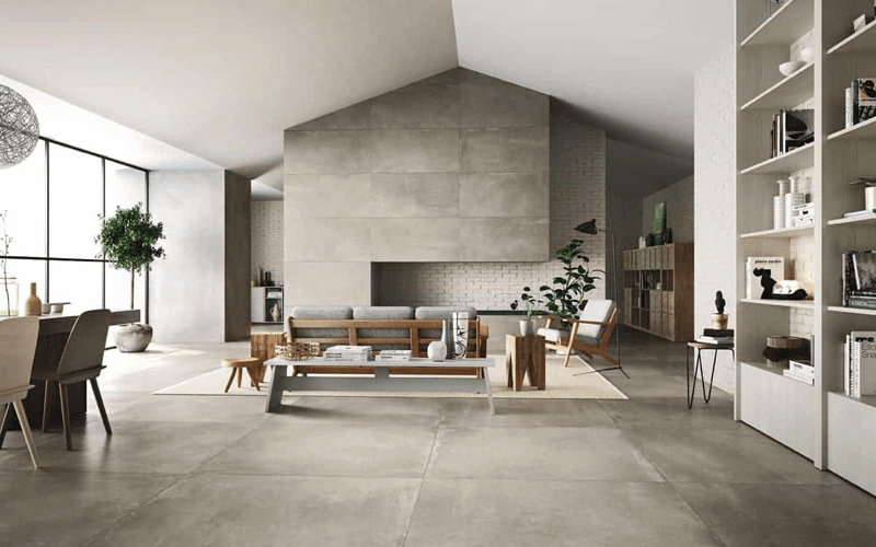
2. Matching Dark-colored Ceramic Floors:

Grey color living room and dining room furniture

Dark ceramic floors, like charcoal or slate, provide a dramatic foundation. Balance their depth with lighter wall paint colors such as Pantone Hazel (a warm, earthy brown) or Pantone Bison (a soft, neutral tan). These colors create contrast, preventing the room from feeling too closed in and adding a touch of sophistication.

3. Creating Depth with Complementary Colors:

Modern living room designer furniture

For a dynamic and visually stimulating effect, consider complementary colors. Pair light ceramic floors with Pantone Glacier Green (a refreshing, cool green) or Pantone Lavender (a soothing, muted purple). Similarly, dark ceramic floors can be paired with Pantone Coral (a vibrant, warm pink-orange) or Pantone Peacock Blue (a rich, deep blue). These combinations inject energy and depth into the room, making a bold statement.

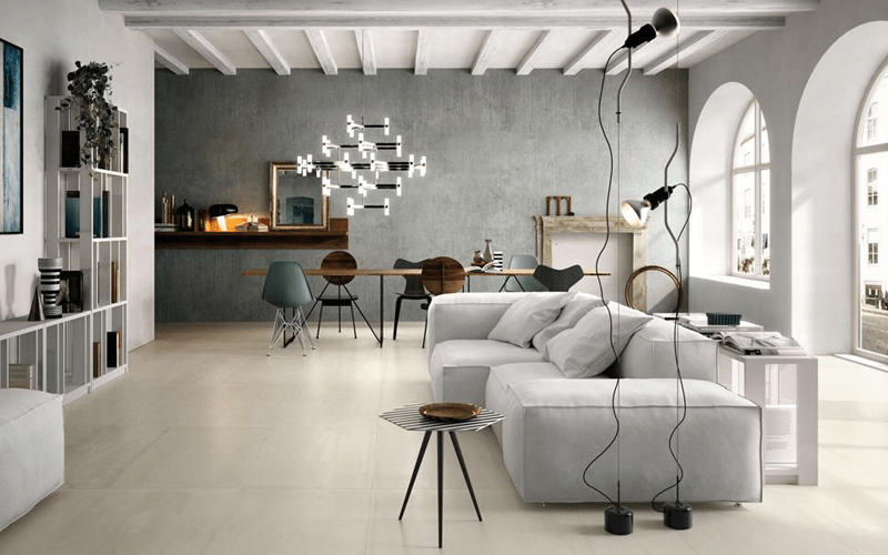
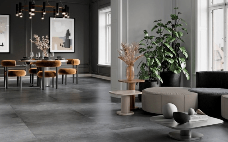
4. Using Monochromatic Schemes:

Monochromatic schemes involve selecting different shades of the same color. For instance, if you have light gray ceramic floors, choose varying shades of gray from the Pantone card for the walls. This creates a sophisticated and elegant atmosphere, where the subtle differences in shades add dimension without overwhelming the senses.

5. Accentuating with Bold Accents:

Introducing bold accents can elevate the room's style. Choose a vibrant color from the Pantone card, like Pantone Flame (a lively, warm orange) or Pantone Ultra Violet (a bold, deep purple), and use it sparingly on furniture, artwork, or decorative elements. This technique adds a pop of color, making the space visually exciting without overpowering the primary palette.

6. Considering Room's Purpose:

Different rooms serve different purposes, and the color scheme should reflect this. Calming hues like Pantone Serenity (a serene blue) work well in bedrooms, while energetic colors like Pantone Fiery Red (a vibrant, warm red) can enhance the vitality of living rooms or dining areas. Consider the room's function and select colors that align with the desired mood and ambiance.

7. Experimenting with Patterns:

Ceramic tiles offer diverse pattern choices. Experiment with patterns like chevron, herringbone, or mosaic, combining different shades from the Pantone card within the pattern. This creates visual interest and can serve as a focal point within the room.

In conclusion, the Pantone color card serves as a versatile tool to guide your ceramic floor and wall paint color selections. By understanding the impact of different hues and their combinations, you can craft a space that reflects your personality, style, and the desired ambiance. Whether you opt for subtle tones, bold contrasts, or intricate patterns, the key lies in achieving a harmonious balance that resonates with the room's purpose and your aesthetic preferences, transforming your space into a haven of elegance and sophistication.