
When it comes to interior design, one of the most crucial decisions homeowners face is choosing the right color scheme for their floor and wall paint.
The colors you select play a pivotal role in setting the tone, ambiance and overall aesthetic of your living space.
The relationship between flooring and walls is particularly important because these two surfaces occupy a large percentage of the visual field. A well-balanced combination can make a room feel larger, warmer, calmer and more cohesive, while a poor combination can make the same space feel disconnected or visually overwhelming.
This article explores the importance of coordinating floor and wall colors, the different types of floor and wall finishes available, and practical methods for selecting wood and ceramic floor colors. It also provides example matching schemes using the Pantone color system.
The best interior color scheme is not simply about choosing beautiful colors — it is about making those colors work together.
By considering natural light, room size, existing furniture, material characteristics, maintenance requirements and the atmosphere you want to create, you can develop a more harmonious and practical interior design.
The Importance of Matching Floor and Wall Paint Colors
The harmony between floor and wall colors is similar to the relationship between different instruments in an orchestra. When every element works together, the result feels balanced and natural.
Mismatched colors can make a room appear chaotic, disconnected or visually uncomfortable. Matching the colors thoughtfully, on the other hand, creates a seamless visual flow throughout the space.
A coordinated floor and wall combination can also influence how large a room appears. Lighter and softer combinations can make a room feel more spacious and open, while darker combinations can create a warmer and more intimate atmosphere.
The objective is not necessarily to make the floor and walls the same color. Instead, the goal is to create a relationship between their tones, saturation, brightness and material textures.
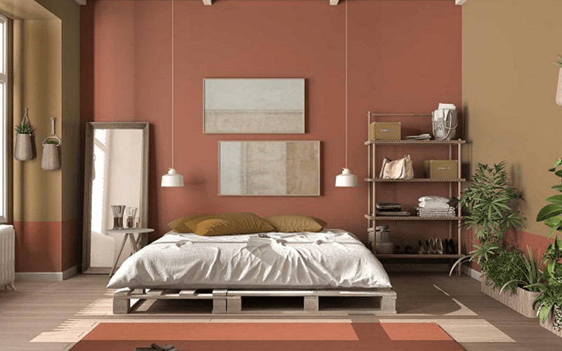
Understanding Floor and Wall Decorations
Flooring and wall coverings are available in many different forms, from traditional hardwood and luxurious marble to ceramic tiles, engineered flooring and contemporary laminates.
Each material has its own texture, reflectivity, color variation and visual character. These characteristics influence how the material interacts with wall paint and furniture.
Wood flooring generally introduces warmth and natural texture. Ceramic and stone surfaces can create a more structured or contemporary appearance, while lighter finishes can reflect more light and contribute to a sense of openness.
For this reason, color selection should never be considered separately from the material itself. The same color can look completely different depending on whether it appears on natural wood, ceramic, stone or painted surfaces.
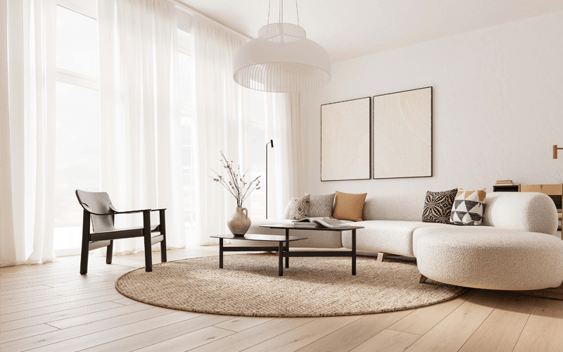
How to Choose the Right Wood Floor Color
Choosing the right wood floor color is an important interior design decision because flooring affects both the visual identity of the room and its perceived size.
Natural light should be one of the first factors considered. Rooms with abundant sunlight can accommodate lighter wood colors such as oak, maple or hickory, which can amplify the sense of openness and create an airy atmosphere.
Rooms with limited natural light can benefit from warmer and darker wood tones such as walnut, mahogany or cherry. Darker woods absorb more light and can create a comfortable and intimate environment.
The existing color palette is equally important. Consider the colors of furniture, walls, doors, curtains and decorative elements before selecting the floor. Neutral walls generally provide greater flexibility because a wider range of wood shades can work with them.
Wood color also influences the perceived style of the room. Light woods such as pine and ash can create a casual contemporary or minimalist feeling. Mid-toned woods such as oak and hickory provide a balance between warmth and sophistication. Dark woods such as walnut and mahogany can create a more luxurious and formal atmosphere.
Maintenance should also be considered. Lighter wood floors generally make dust and some minor signs of wear less noticeable, which can be useful in high-traffic homes or households with pets and children. Darker floors can be extremely elegant but may require more frequent cleaning to maintain their appearance.
Before making a final decision, test actual flooring samples inside the room. Natural and artificial lighting can significantly change the perceived color of wood throughout the day.
The finish is another important consideration. Matte finishes provide a natural and understated appearance and can help disguise minor imperfections. Semi-gloss and high-gloss finishes create more visual reflection but can make scratches and marks more noticeable.
For environmentally conscious projects, buyers can also consider reclaimed wood, bamboo and engineered wood products sourced from responsible suppliers.
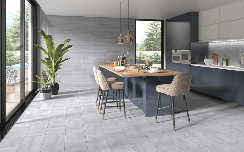
How to Choose the Right Ceramic Floor Color
Ceramic flooring offers a different range of possibilities because ceramic tiles are available in many colors, patterns, textures and finishes.
Room functionality should be considered first. High-traffic areas such as kitchens and hallways can benefit from colors that are more forgiving of dirt and stains, while lighter tiles can create a clean and airy atmosphere in bathrooms and bedrooms.
The size of the room also matters. Large tiles in lighter shades can visually expand smaller spaces, while smaller tiles can introduce more detailed patterns and character into larger rooms.
Color psychology can help establish the desired atmosphere. Cool colors such as blues and greens can create a calm environment, while warm colors such as reds and oranges can introduce energy. Neutral colors such as beige and gray provide a flexible background for furniture and decorative accents.
The relationship between the ceramic floor and wall color is particularly important. If the walls are neutral, patterned or more expressive floor tiles can work well. If the walls already contain strong colors or patterns, simpler floor tiles may provide better visual balance.
Ceramic finishes also influence the final appearance. Glossy tiles reflect light and can make a small room appear brighter, while matte finishes create a more understated and natural aesthetic.
Durability and maintenance are additional advantages of ceramic flooring. Glazed ceramic tiles can provide strong resistance to stains, water and everyday wear, making them suitable for kitchens and bathrooms.
Ceramic tiles also allow designers to experiment with patterns such as herringbone, chevron, mosaic and geometric arrangements.
For sustainable projects, buyers can investigate ceramic products manufactured using recycled materials or more environmentally responsible production processes.
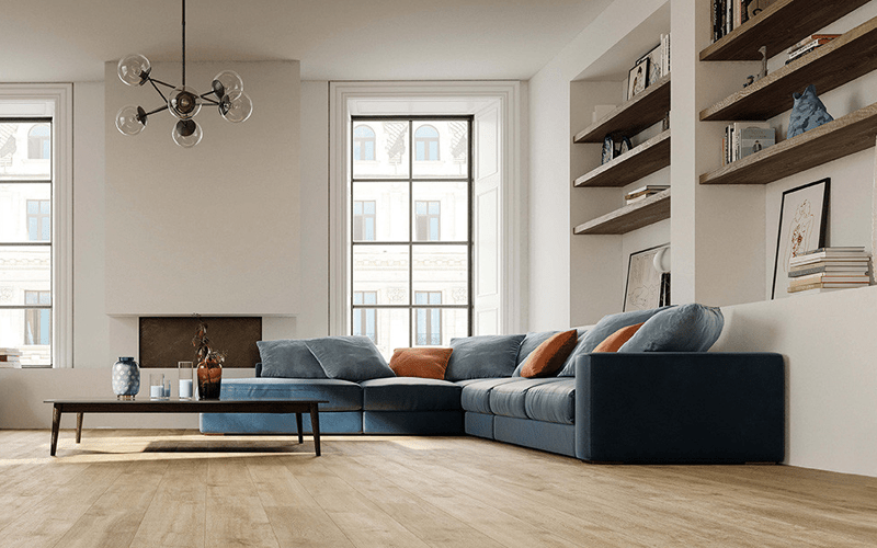
Wood Floor and Wall Paint Color Matching
Creating harmony between wood flooring and wall paint is about balancing warmth, contrast, brightness and the overall atmosphere of the room.
Pantone provides a standardized color reference system that can be useful when communicating specific color intentions between designers, manufacturers and other project stakeholders.
For light wood floors such as oak or maple, soft and tranquil wall colors can maintain the sense of openness. Examples include Pantone Serenity or Pantone Rose Quartz. These gentle tones create a calm background while allowing the natural character of the wood to remain visible.
Mid-toned woods such as hickory or cherry offer greater flexibility. They can be combined with earthy tones such as Pantone Tawny Birch or deeper shades such as Pantone Grapeade to introduce additional depth.
Dark wood floors naturally create a more sophisticated visual foundation. Lighter wall colors such as Pantone Oyster Mushroom or Pantone Hazelnut can provide contrast and prevent the room from feeling excessively dark.
For a more contemporary interior, bold contrasting colors can also be introduced. Light wood floors can work with stronger tones such as Pantone Fiesta or Pantone Lapis Blue, while dark woods can be contrasted with colors such as Pantone Buttercup or Pantone Green Flash.
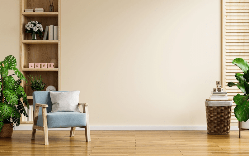
Matching Light Wood Floors
Light wood floors create a bright and spacious foundation for an interior.
When working with oak, maple or other pale wood tones, the objective is often to preserve the visual openness of the room rather than introduce excessive contrast.
Soft blues, muted pinks, warm whites, pale beige and other gentle tones can create a calm backdrop for light wood.
Pantone Serenity is one example of a soft blue that can create a tranquil atmosphere, while Pantone Rose Quartz introduces a warmer and more delicate character.
These combinations are particularly suitable for contemporary, minimalist and Scandinavian-inspired interiors where natural light and visual simplicity are important.
However, actual samples should always be tested in the room because the appearance of both paint and wood can change considerably under different lighting conditions.
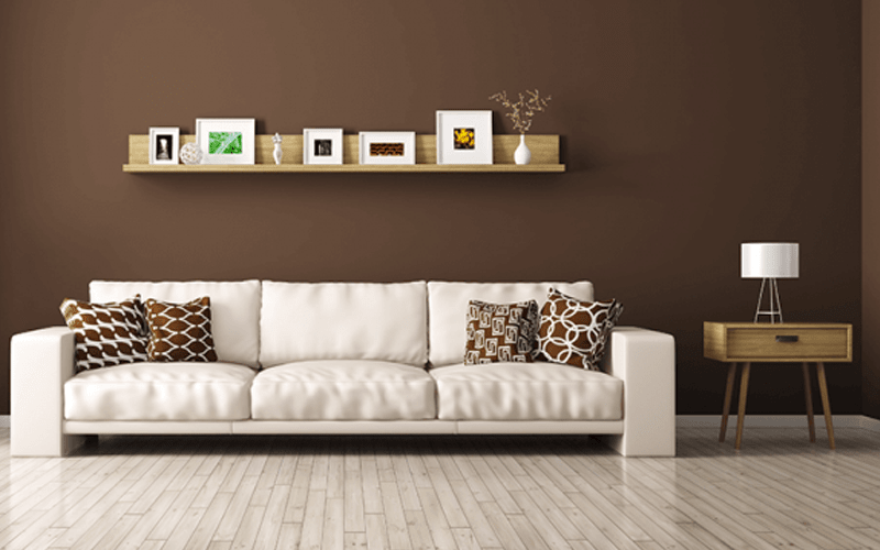
Matching Mid-Toned Wood Floors
Mid-toned woods such as hickory and cherry are among the most versatile flooring options because they sit between very light and very dark palettes.
Their natural warmth can be complemented by earthy neutrals, muted colors or deeper accent tones.
Pantone Tawny Birch provides an earthy and understated option that works naturally with warm wood. Pantone Grapeade can introduce a deeper and more dramatic contrast for interiors that require additional visual depth.
The furniture should also be considered. A mid-toned wood floor can act as a bridge between lighter upholstery and darker furniture, helping different elements of a room feel connected.
The result can be a warm, sophisticated and inviting interior without the heaviness sometimes associated with very dark flooring.
Matching Dark Wood Floors
Dark wood floors such as walnut and mahogany naturally create a strong visual presence and can give an interior a luxurious and sophisticated character.
Because dark flooring absorbs more visual weight, lighter wall colors can help maintain balance and prevent the room from feeling too enclosed.
Pantone Oyster Mushroom and Pantone Hazelnut are examples of soft neutral tones that can create contrast while preserving warmth.
Dark floors can work particularly well in dining rooms, offices, luxury residential interiors and other spaces where a richer atmosphere is desired.
The key is to balance the dark floor with sufficient light, appropriate wall colors and furniture that does not create excessive visual weight.
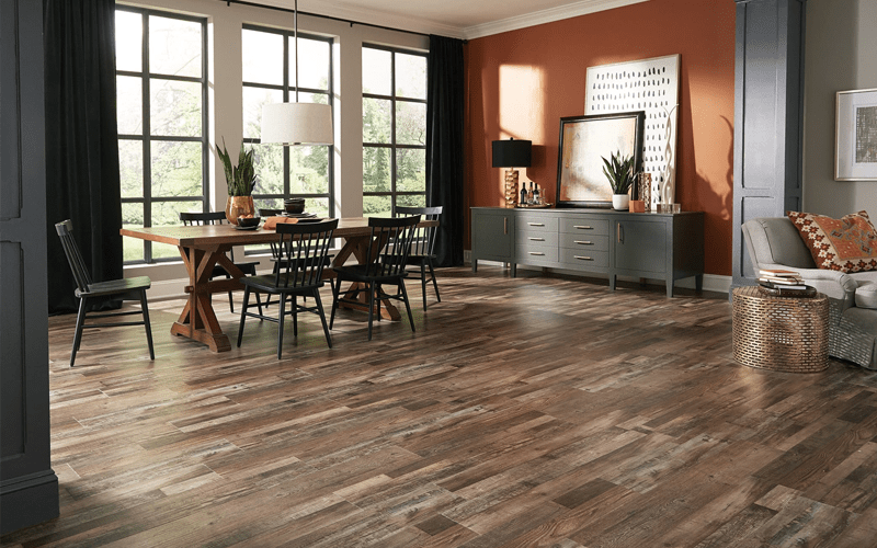
Creating Contrast and Using Accent Walls
A harmonious interior does not necessarily need to use only subtle or neutral colors. Strong contrast can create personality when it is carefully controlled.
Light wood flooring can be paired with stronger colors such as warm red-orange or deep blue to create a contemporary statement.
Dark wood flooring can similarly be combined with brighter colors such as yellow or energetic green to create visual contrast.
One practical approach is to use an accent wall rather than applying the bold color throughout the entire room. A fireplace wall, architectural niche or other visually important surface can become the focal point.
This approach allows designers to experiment with stronger colors without overwhelming the entire interior.
The position of the accent wall should also be considered in relation to windows, furniture arrangement and natural light.
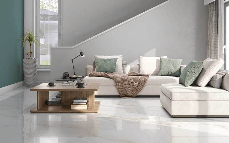
Matching Light-Colored Ceramic Floors
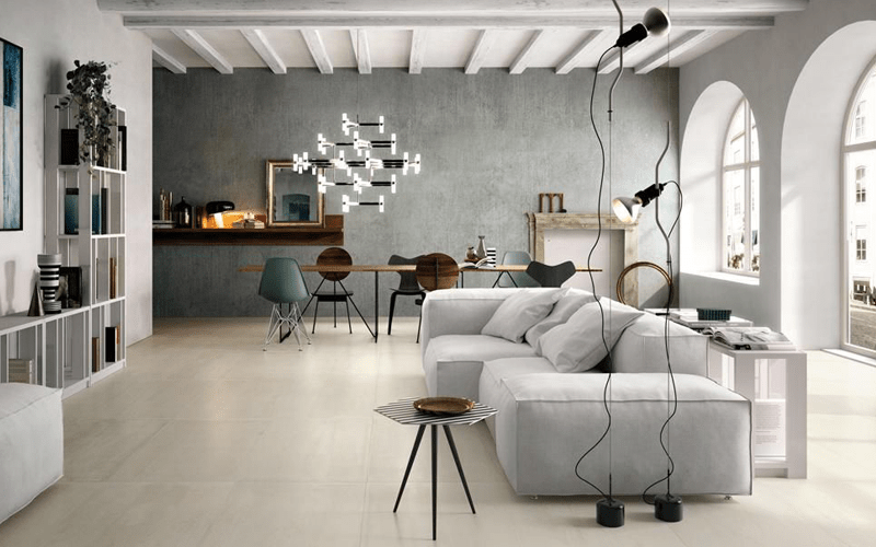
Light-colored ceramic floors, including soft whites and pale grays, create a clean and airy foundation.
These floors can be combined with soft wall colors such as Pantone Chiffon Yellow or Pantone Ice Flow.
Chiffon Yellow can introduce a subtle sense of warmth, while Ice Flow provides a cooler and cleaner appearance.
These combinations are particularly effective when the objective is to preserve brightness and make the room feel visually spacious.
Large-format light ceramic tiles can further reinforce this effect because fewer grout lines create a more continuous visual surface.
Matching Dark-Colored Ceramic Floors
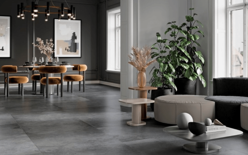
Dark ceramic floors such as charcoal, slate and other deep tones create a dramatic foundation for an interior.
Because the flooring already provides strong visual weight, lighter or warmer wall colors can help restore balance.
Pantone Hazel and Pantone Bison are examples of earthy neutral tones that can soften the contrast while maintaining a sophisticated atmosphere.
This combination can work particularly well in contemporary living rooms, dining areas and commercial interiors where a stronger visual identity is desired.
Lighting becomes especially important with dark ceramic flooring. Adequate natural or artificial light can prevent the space from becoming visually heavy.
Creating Depth with Complementary Ceramic Colors
Complementary colors can create a more dynamic and visually stimulating interior.
Light ceramic floors can be combined with refreshing tones such as Pantone Glacier Green or softer shades such as Pantone Lavender.
For dark ceramic floors, stronger complementary colors such as Pantone Coral or Pantone Peacock Blue can create contrast and introduce additional personality.
These combinations are particularly useful when the objective is to move beyond a completely neutral interior and create a distinctive design identity.
The strongest colors should generally be used selectively. Furniture, artwork, cushions and decorative accessories can reinforce the accent color without making the entire room visually overwhelming.
Using Monochromatic Schemes
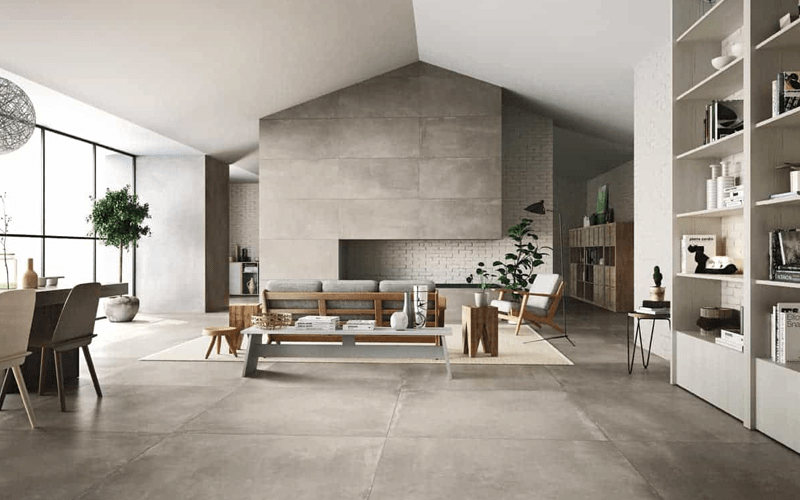
A monochromatic color scheme uses different shades and tones of the same basic color family.
For example, a light gray ceramic floor can be paired with a slightly darker or lighter gray wall to create a sophisticated and understated interior.
The advantage of this approach is that it creates continuity without requiring strong color contrasts.
Different textures can then provide visual depth. A matte ceramic floor, textured wall, upholstered sofa and natural wood furniture can all belong to a similar color family while still creating visual variety.
Monochromatic schemes are particularly effective in minimalist interiors where the objective is to create a calm and coherent environment.
Accentuating the Interior with Bold Colors
Bold accent colors can elevate a neutral interior when they are introduced selectively.
Colors such as Pantone Flame or Pantone Ultra Violet can be used on furniture, artwork, cushions or decorative elements rather than across the entire wall surface.
This approach creates a visual focal point while preserving the overall harmony between the floor and walls.
The accent color should ideally appear in several small elements throughout the room so that it feels intentionally integrated rather than isolated.
Match the Color Scheme to the Purpose of the Room
Different rooms serve different purposes, so the color scheme should reflect the atmosphere that the space is intended to create.
Calming colors such as soft blues can work well in bedrooms where relaxation is important.
More energetic colors can be appropriate for living rooms, kitchens and dining areas where social interaction and activity are central to the space.
Neutral tones such as beige, gray and soft white provide greater flexibility and can be adapted to different furniture styles over time.
The room function should therefore be considered together with natural light, furniture, flooring material and personal preferences rather than treated as an isolated color decision.
Experimenting with Ceramic Patterns
Ceramic flooring provides an additional opportunity to introduce visual interest through patterns and tile arrangements.
Chevron, herringbone, mosaic and geometric patterns can transform an otherwise simple floor into a focal point.
When patterned flooring is used, wall colors should generally remain more controlled so that the room does not become visually overloaded.
Different shades from the same color family can also be incorporated into a ceramic pattern to create depth without introducing too many competing colors.
The final objective should always be balance between the floor, walls, furniture and decorative elements.
Floor & Wall Color Selection Checklist
Before purchasing flooring or paint, evaluate the entire room rather than choosing colors independently.
- Check how much natural light enters the room.
- Consider the size and proportions of the space.
- Identify the existing colors of furniture and architectural elements.
- Decide whether you want a warm, cool, neutral or contrasting atmosphere.
- Choose the floor material before finalizing the wall paint.
- Test real flooring and paint samples inside the room.
- Observe samples under both natural and artificial lighting.
- Consider cleaning and long-term maintenance requirements.
- Check how the colors work with doors, cabinets and furniture.
- Avoid choosing colors only from digital images because screens can distort color perception.
How to Create a Harmonious Interior Palette
A successful color scheme should connect the major surfaces of the room before adding decorative accents.
- Start with the dominant floor color.
- Choose a wall color that complements or intentionally contrasts with the floor.
- Use neutral colors when the floor already has strong patterns or textures.
- Use accent walls when you want stronger colors without overwhelming the room.
- Repeat accent colors through furniture, artwork or accessories.
- Use lighter colors to increase the perception of space.
- Use darker colors to create warmth and visual intimacy.
- Consider the psychological effect of warm and cool colors.
- Use consistent tones between adjoining rooms where appropriate.
- Always evaluate the final combination using physical samples.
A beautiful floor color does not exist in isolation — its real impact depends on how it interacts with the walls, furniture, light and materials around it.
The art of matching floor and wall colors is ultimately about creating visual balance.
Wood flooring brings natural warmth, texture and character, while ceramic flooring provides durability, versatility and a wide range of colors and patterns. Neither material has one universally correct color. The right choice depends on the room, lighting, furniture, lifestyle and atmosphere you want to create.
Pantone color references can be useful when communicating color concepts and developing consistent interior palettes, but they should be treated as a guide rather than an absolute rule. Real materials and paints should always be evaluated in the actual space because lighting can dramatically change how colors appear.
For light floors, softer wall colors can preserve brightness and openness. Mid-toned floors offer flexibility and can support both neutral and stronger colors. Dark floors benefit from careful contrast and sufficient light to prevent the room from feeling too heavy.
Ceramic floors offer additional opportunities through patterns, finishes and different tile sizes. A simple monochromatic palette can create a sophisticated environment, while carefully controlled complementary colors can introduce energy and personality.
The most important principle is to consider the entire room rather than selecting each element separately. Flooring, walls, furniture, lighting and decorative elements should work together as one visual composition.
Ultimately, successful interior design is not about following one fixed color formula. It is about understanding the relationship between materials, colors, light and human perception, then using those relationships to create a space that is both beautiful and functional.
No. Floor and wall colors do not need to be identical. In most interiors, a complementary relationship between the two creates more depth and visual interest. The important factors are tone, brightness, warmth and contrast.
Light wood floors generally work well with soft neutrals, pale blues, warm whites, muted pinks and other gentle colors. Pantone Serenity and Pantone Rose Quartz are examples of the type of soft tones that can complement light wood.
Lighter neutral wall colors can balance dark wood floors effectively. Warm gray, creamy beige and other light neutral tones can provide contrast while preserving the sophisticated character of dark flooring.
They can be, but they require careful consideration of lighting and wall colors. Dark floors combined with lighter walls and sufficient natural or artificial light can create an attractive contrast. In poorly lit rooms, however, very dark flooring can make the space feel smaller.
Neither material is universally better. Ceramic offers excellent durability, water resistance and a wide range of patterns, while wood provides natural warmth and texture. The appropriate choice depends on the room, usage, maintenance expectations and design objectives.
Pantone references can be useful for communicating and comparing color concepts, especially in professional design and manufacturing projects. However, physical paint samples should always be tested in the actual room because lighting and surrounding materials can change the perceived color.
Lighter floor and wall colors, large-format tiles, consistent color palettes and good natural lighting can help create the perception of a larger space. Reducing strong visual interruptions can also make the room feel more continuous.
Use bold colors selectively through an accent wall, furniture, artwork or decorative accessories. Keeping the main floor and wall palette relatively controlled allows stronger colors to become focal points rather than visual distractions.
Looking for Furniture to Complete Your Interior Design Project?
Lohabour works with international buyers, designers, distributors, hospitality projects and residential developments to manufacture furniture adapted to specific design concepts, materials, dimensions and project requirements.
Discover Our Products